Published: 2021-10-01 | 3 min read
- JavaScript
- React
Abstraction is one of the most fundamental concepts in programming:
"the process of simplifying code by finding similarities between different parts of the code and extracting shared logic into a named component (such as a function, module, etc...), thereby reducing the amount of code required." (EricElliott)
By separating the code into independent units (i.e. functions or classes) you can reduce code duplication and increase reusability, while improving security and reliability of the application.
We use abstraction all the time in programming, whether by extracting frequently repeated operations into functions, or when importing internal or external modules and packages.
One of abstraction techniques is composition, which allows combining simpler data types into more complex ones (Wikipedia). This technique exists in functional- as well as object-oriented programming, and React's composition model is one of its fundamental blocks.
How to compose React components?
Imagine that you're building an app, where you will be often using a card to display information. The card will consist of three sections: heading, main and actions. While the heading and actions will be standardized across all cards, the main of a card might differ a lot between cards. You can achieve this through composition by using the special children prop, along with the custom props relating to title, subTitle, and actions with some default values.
const Card = ({ title, subTitle, children, actions = ['like', 'comment'] }) => (
  <div class="card">
    <div class="card-heading">
      <h2>{title}</h2>
      <p>{subTitle}</p>
    </div>
    <div class="card-main">{children}</div>
    <div class="card-actions">
      {actions.map((action) => (
        <button>{action}</button>
      ))}
    </div>
  </div>
);
With the Card component defined, you can already apply composition when using it in another component to display a list of items. The entire ul element will be passed to the Card component in the children prop.
const App = () => (
<div className="App">
<h1>React composition</h1>
<div class="cards">
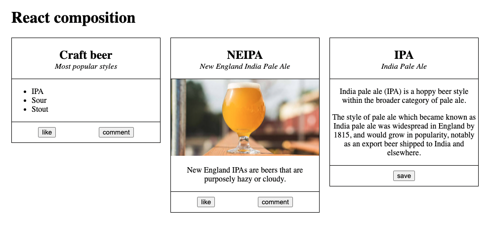
<Card title="Craft beer" subTitle="Most popular styles">
<ul>
<li>IPA</li>
<li>Sour</li>
<li>Stout</li>
</ul>
</Card>
</div>
</div>
);If you're not planning to use lists inside the main section of a Card in another places within your app, this is a perfectly valid approach. However, you're planning to have a lot of cards that will include a photo below the heading. In this case, you can again use composition in order to make the Card component more specialized and turn it into PhotoCard.
const PhotoCard = ({ src, alt, children, ...rest }) => (
  <Card {...rest}>
    <img src={src} alt={alt} />
    {children}
  </Card>
);
PhotoCard introduces two new props, src and alt, which are necessary in order to display the photo. You can still make this new component further customisable by allowing children to be passed. What is important to remember, is that you still need to capture the props from the Card component, such as title, subTitle and actions. You can do that efficiently by collecting them with a ...rest operator and then spreading them into the Card component inside the PhotoCard component.
<PhotoCard
  title="NEIPA"
  subTitle="New England India Pale Ale"
  src="https://www.beercartel.com.au/product_images/uploaded_images/neipa2017-cp.jpg"
  alt="NEIPA photo"
>
  <p>New England IPAs are beers that are purposely hazy or cloudy.</p>
</PhotoCard>
You can follow the same logic when creating another specialized variation of the card that you might use frequently, i.e. TextCard, which receives paragraphs, an array of strings as a prop. In this case, you can decide to no allow any further elements to be passed via children prop.
const TextCard = ({ paragraphs, ...rest }) => (
  <Card {...rest}>
    {paragraphs.map((paragraph) => (
      <p>{paragraph}</p>
    ))}
  </Card>
);
You can now use the TextCard along with other Card variations within your app. By passing actions to the TextCard, you can also override the default values specified in the Card component.
const App = () => {
  const ipaInfo = [
    'India pale ale (IPA) is a hoppy beer style within the broader category of pale ale.',
    'The style of pale ale which became known as India pale ale was widespread in England by 1815, and would grow in popularity, notably as an export beer shipped to India and elsewhere.',
  ];

  return (
    <div className="App">
      <h1>React composition</h1>
      <div class="cards">
		// ...
        <TextCard
          title="IPA"
          subTitle="India Pale Ale"
          paragraphs={ipaInfo}
          actions={['save']}
        />
      </div>
    </div>
  );
};
You can find the code from these examples in this GitHub repository.
Conclusion
Composition is a very fundamental and powerful concept in React, as it makes it easier to manage your codebase by avoiding repetition, while providing flexibility in situations where you don't know what you might want to render inside a component ahead of time, or if you want to customize a component into its more specialized variation.